From UPPs to Date amendment NS
A minor feature with major pain points — Date Amendment 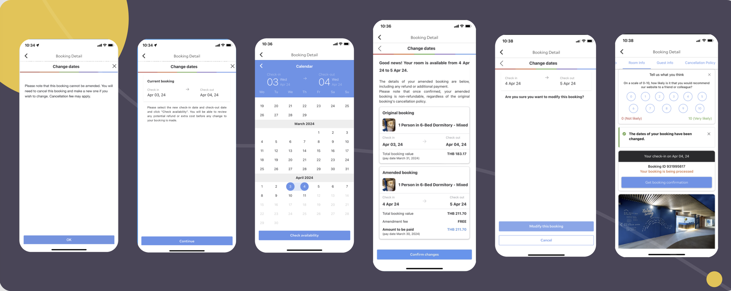
⬆️ In the previous flow, over half of users were blocked at the first step, causing a steep drop-off throughout the journey — with a final completion rate of less than 4%.
Date Amendment (post-booking date change) served <5% users but caused outsized cost:
🔺 $15M/year in support (7% of HT), stalling roadmap for 2 quarters
🔺 17× higher maintenance footprint vs. most-used flow
🔺 Generated the most bugs, up to 17× bug-per-usage ratio

👉 Became a case study of hidden complexity → tech debt, and the North Star of our redesign initiative.
📊 What the Data Revealed
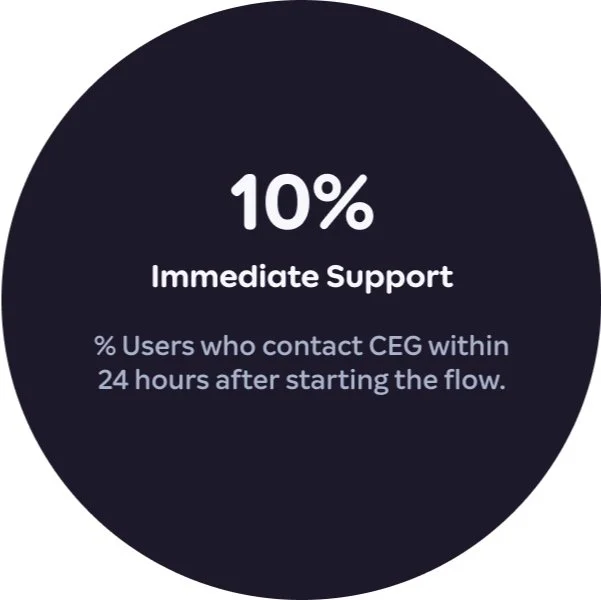
Only 4% completed the flow via self-service.
10% reached out to customer support within 24h after starting the flow.
👉 This exposed two core issues:
Confusing / broken steps → even eligible users couldn’t finish.
Lack of guidance → users defaulted to support, creating uncertainty.

The Invisible Iceberg: Rebuilding Logic Across Fragmented Systems
Biggest challenge wasn’t UI — it was hidden UX debt across legacy systems.
👑 My Scope & Leadership
As lead product designer, I drove the NS redesign by:
Auditing fragmented bug logs & rules → surfaced root UX breakdowns
Visualizing blind spots with system mapping & diagrams
Translating findings & benchmarking into systematic design proposals + A/B testable fixes
Aligning PMs, engineers, and policy stakeholders on a simplified MVP with measurable goals
👉 This was where my role expanded from UI design → driving system logic & cross-team alignment.

⬆️ Historical bugs and UX breakdown

⬆️ Mapping out the unknowns to be resolved
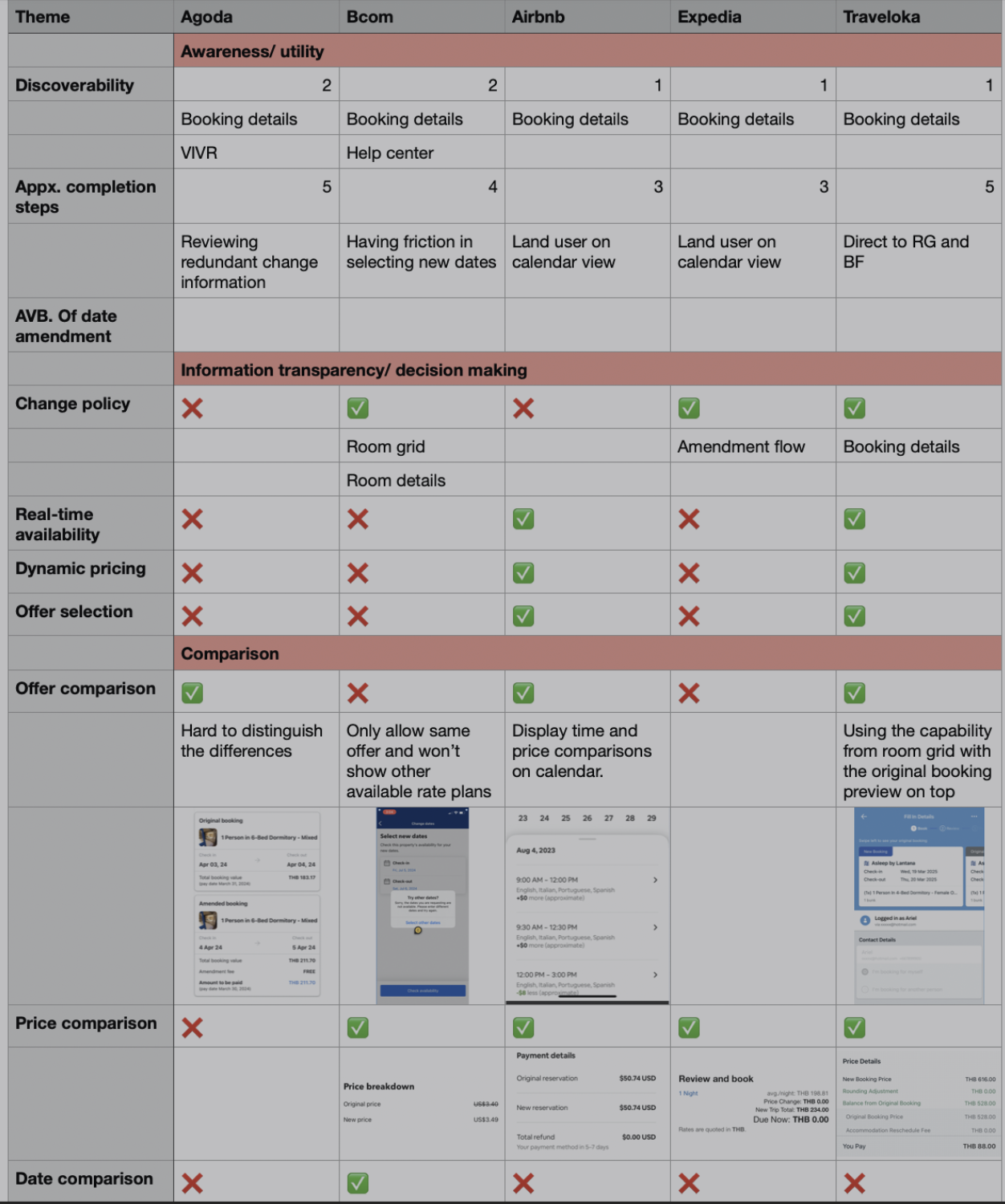
⬆️ Competitor analysis after UX audit
🧩 Design UPPs: 3 Hidden Breakdowns
To untangle the legacy system, I audited the core DA journey and uncovered users pain points into 3 main themes:
🔥 Theme 1: Unclear Rules & Eligibility50% blocked at first step (no paths / explanation)
91% of support time from non-refundable bookings
→ Eligibility logic fragmented & unclear
🔥 Theme 2: Opaque Availability & Cost Info72% of errors tied to calendar availability
Users couldn’t predict bookable dates or costs
→ No visibility, sudden price shifts
🔥 Theme 3: Vague Actions & Feedback15% error rate from mismatched prices, allotment fails, unclear payments
→ Inconsistent / missing feedback
👉 “Users faced blocked entry, blind calendars, and broken feedback — driving high drop-off and support cost.”✨ Turning Pain Points into Design Impact
Audits revealed 3 core issues — we resolved each with focused design solutions.
🔧 I. Clarifying Rules & Eligibility1. Edit Before Cancel
Allowing users to change booking details before forcing cancellation
👉 Already supported by 3 of 4 competitors
2. Eligibility + Alternative Paths
If amendments aren't allowed, we now:
• Clearly explain why
• Offer alternate and clear nudges (contact property / request free cancel)3. Unified Amendment Rules
90% hotel partners enabled Proactive Fee Waiver → removed unnecessary blocker into a seamless path.

🔧 II. Reveal Availability & Cost Early1. Show Availability Status Upfront
Display clear availability indicators in calendar → users see what’s bookable before entering flow.
2. Offer Alternatives When Unavailable
When unavailable, suggest nearby dates / similar properties / flexible options → reduce frustration and retain users.

3. Introduce Benefit Selection in Flow
Let users to select new benefits (e.g., breakfast, late checkout) directly during amendment → smoother decisions, less drop-off.
👉 Only Traveloka allows benefit selection via RG; other competitors lack integrated benefit selection.
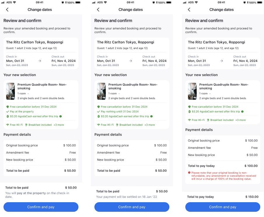
4. Add Visual Comparison of Benefits & Price Changes
Show clear side-by-side highlights of cost & benefits → users see trade-offs instantly, boosting trust.
👉 no major competitor currently provides this comparison feature upfront.

🔧 III. Clear Actions & Transparent Confirmation1. Clarity Before Confirm
Show updated terms & payment changes as edits are made
→ no surprises later.
2. Aligned Confirmation
Final page mirrors updated prices, policies, and methods
→ matches what users saw earlier.
✨To bring these design visions into reality, we evaluated MVP paths not just by UX impact, but by feasibility and business value.✨🔧 How We Moved From Vision → MVP
a strategic MVP targeting the highest-impact issuesChallenge
Full redesign = high risk + high cost, slow path to value
Our Approach
Leverage existing Cancel & Rebook (CXR) infra → deliver Phase 1 MVP with impact + feasibility + user coverage.
Outcome
Prioritized critical fixes, Delivered higher ROI (+$3.3M/year) with faster impact, despite higher initial dev effort.
Phase 1 MVP Trade-Offs: Evaluating Strategic PathsCancel & Rebook let us scale a single clear flow, instead of keeping fragmented rules we offer less confusion and a more predictable experience to the users.

⬆️ A side-by-side comparison of refactoring the existing flow on MMB vs. leveraging Cancel & Rebook (CXR) within the current booking infrastructure — balancing dev effort, scalability, speed, risk, and business impact.
🚀 MVP Delivery: 90% Use Case Coverage, Minimal RiskScope
Covered refundable & non-refundable bookings
Edits: dates, rooms, guest count
Safe payment flow (charge + refund post-edit)
Impact highlights
✅ Quick impact, aligned with long-term vision
✅ Simpler UX → fewer drop-offs & support
✅ Low rollout friction → no infra rebuild
Early Signals & Impact
Within weeks of launch in Q2, we saw clear positive impact:
🧑💻 Unlocked Extra Dev Resources
Initiative prioritized → +3 devs allocated
Faster MVP build & fewer post-launch bugs
📉 Lowered Support Load
Drop in date-related HT after launch
Users gave positive feedback on clearer offers & comparison
🔁 Future Expansion
PM & Ops flagged improved flow consistency
Paved way for broader rollout & new revenue (e.g. room upgrades)
✅ MVP shipped in Q2 → supported live A/B + usability testing
Early signals boosted team confidence to invest in Phase 2 (UI clarity + cross-platform consistency); with the early testing showed 90% use case coverage.
Post-launch metrics (e.g., completion time, refund rate) were also tracked by the team after the lauch.
🚀 Strategic Learnings
Stepped beyond UI into strategic product thinking — untangling legacy, aligning teams, and delivering value under constraints.
Systems thinking: Scoped a future-proof MVP with PMs/engineers → reduced long-term logic debt & enabled phased rollout.
Execution under constraints: Prioritized high-impact fixes → shipped MVP within quarter, cut support load.
Cross-functional alignment: Synthesized UT + Ops data → achieved team buy-in & shaped roadmap with confidence.
🔜 What’s Next
Validate impact via A/B testing (drop-offs, support)
UI improvements aligned with unified booking funnel
More usability testing for eligibility + offer clarity
🌝
By bridging UX clarity, system logic, and cross-team alignment, this redesign laid the foundation for a scalable, user-centered booking experience
— covering 90% of user cases with minimal risk and setting the stage for Phase 2.