Designing Experience for developer Portal
In August of 2018, Huawei, a Chinese multinational technology company reached out to us to redesign their developer website. This is a story about how we guide a business focused company to put themselves into the end users shoes, providing a better user experience while achieving the business goals at the same time.
| Developers Experience |
When we’re talking about product and UX design, people usually related to websites and applications that face the general public. However, we tend to overlook the importance of experience for some unique users groups like developers. Within the digital product market, there is an increasing demand for high quality products for developers as the end users.
Taking the recent growth of Huawei development ecosystem in consideration, we were depending that it was a critical time that we need to start considering Huawei developers’ portal as a full product. During this project, we aimed to redesign the developer portal and to offer Huawei developers an exceptional experience.
GIF: LinkApi
MY ROLE
In this project, I worked as a UX lead from Oct. 2018 to Feb. 2019. I worked closely with the 3 product managers from Huawei and I investigated the main issues of the previous website. During the research stage and the following designed stage I made sure to address the issues that were pointed out.
The visual design team was also involved in the design process, they presented a detailed visual design like banners and graphics.
The redesign website was launched globally in 2019. It took us 3 months from the initial ideas stage to the final fully functional new website launch.
THE RESULTS
According to the traffic analysis and the evaluation, the new website got the result of 4.9M monthly visits, compared to the 1.1M monthly visits of the previous website.
From the user testing of the redesign website, the users’ satisfication rate had increased 2 times compare to the original website.
Previous design of Huawei Developer Website
THE CHALLENGE
Bridging the gap between business and users
Redesigning the Huawei Developer Website was challenging in various aspects. First of all, the website orientation and the users segmentation were not well defined in the previous version. The previous Information architecture (IA) didn’t fit in the full scope of capabilities of Huawei development system and it did not properly present the full services Huawei are offering to the developers.
In addition to the above, the previous website was poorly designed for technically capable Huawei developers. The overall design lacked of consistency and hard to enhance users desirability. However, in business aspect, the developer website needs to consider needs from a majority of business units in Huawei. Every stakeholder involved in this redesign had their own business objectives which made it harder to have a consistent design.
Taking all challenges we were facing in consideration, we established three main goals to work towards the process.
1. Help our clients to achieve the business goal of gaining new users to register as Huawei Developers.
2. Create a platform for developers to have deeper engagement.
3. Provide scalability for the clients as the ecosystem is still growing.

What I had done in this project and the overall process
START WITH THE EXISTING SITE
what the current experience looks like?
From clients data analytics of the previous website, the amount of active users was rather low. It was one of our main focuses to acquire new users to register as Huawei Developer and to boost the user retention rate. In order to gain more insights, I quickly conducted both expert review, analyzing and reviewing the issues within the previous website. Also, I invited 16 real users to participate in a user testing, which helped us gain a better understand of the key decision factors, specifically when and why the developers make use of the developer portal. We researched how users performed their common tasks on the website, and also mapped out the journey of users’ information seeking behaviors.

JOURNEY VISUALISATIONS
Mapping out the existing journey
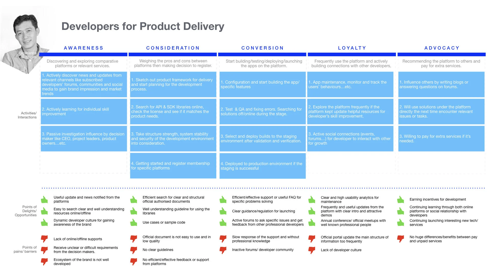
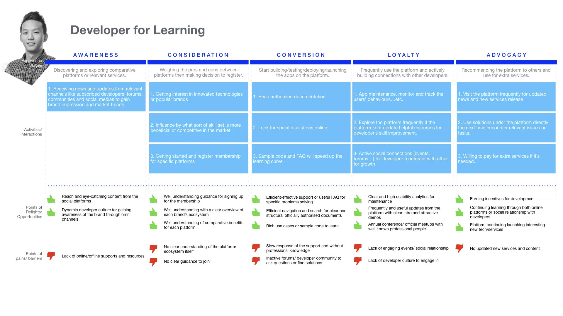
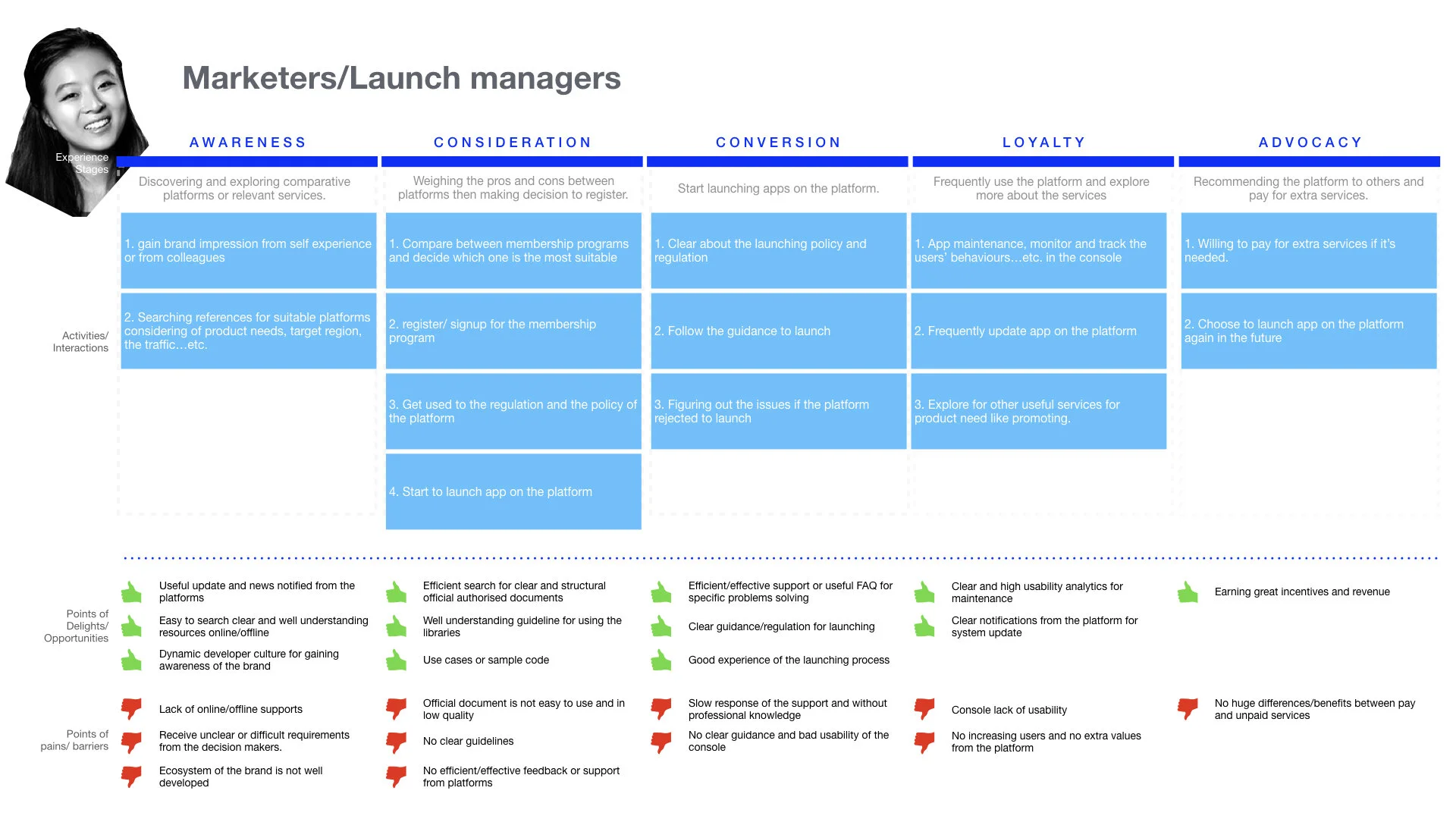
According to the user research and the demographics review from website analysis, I categorized the current website users into three main types:
(1) Developers for delivery (experienced developers)
(2) Developers for learning (amature developers)
(3) Marketers /Launch managers.
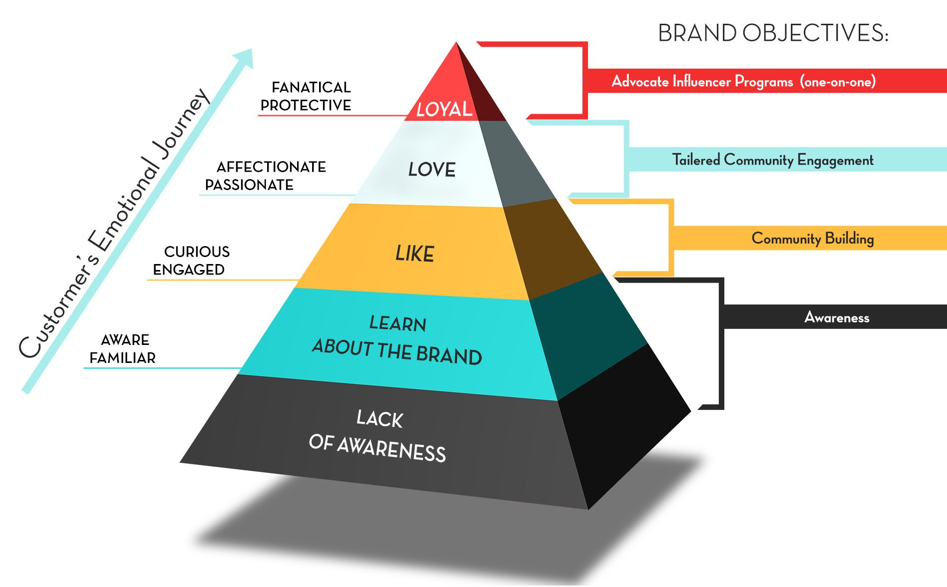
I realized that what they were looking for and what they were expecting on the website are extremely different. I used the [Customer’s emotional journey] to measure users engagement in all stages. From the first impression of Huawei Developer brand to advocate with loyalty, we took users’ points of delights and pains into account. Used these insights as opportunities of redesigning the website with better experience.
https://www.businessnewsdaily.com/2821-consumers-relationships-brands.html
INSIGHTS FROM USERS
Actionable insights
Lack of Awareness
The majority of users indicated in the testing that when they first landed on the website, they didn’t know what Huawei Developer was aiming for and what the differentiators are in comparison to its potential competitors. They had no clue of why they should join as a Huawei developer and what they may gain from the Huawei ecosystem.

Bad Navigation without Logical Categories
Nearly all of the users encountered the navigation issues from the previous website. Both experienced or amateur developers could not reach out specific content through header navigation or the search function. They felt that the provided categories of the capabilities didn’t fit in their knowledge base, which made the whole navigation and search journey a pain.

Lack of On-boarding and Discovery Experience
According to the users journey, users would only land on the capability page (before dive into documentation) if they’re not familiar with the capability and want to gain more information of it. However, the previous website emphasised on too much marketing content instead of guides and tutorials sections to describe more about the development capability. Without the learning stage of gaining more knowledge, the users would not be interested in using the platform nor would they become loyal users and start to develop on it.

Documentation is the Key for a Developer Portal
Documentation helps the developers decide if this is the right ecosystem to dive into and also for them to find the right resources. It should provide a simple interface that brings the most necessary information for the developer to perform their development works. Aside from the rich resources, the ease of use may also drive a better experience for developers, not only to be more efficient to access specific content but also with more functionalities to add speed to their development processes.

Improving Developers Relationship
A good relationship with all other developers is a key aspect for the developers to decide whether the community is big and worthy enough to dive into and become a part of. The previous website didn’t emphasize a lot on developer’s community and there was a lack of providing information like developer gathering events. Users would be more engaged and willing to join as a part if they feel there is a active developers community within Huawei ecosystem.

Be There for Support with Different Topics
Users indicated that they wouldn’t be able to find the right channel to get support while they needed help from using Huawei development services. They needed the right support under different scenarios. Some were development issues, some were product distribution on the platform, and some were regarding finding possible partnership with Huawei.

REFRAMING THE PROBLEM
“how might we help developers to form a better journey from development to distribution?'“
The original Huawei developer portal failed to provide better assistance for their development journey from product building, development to launch for distribution. From the beginning of landing on the website - search and navigation for specific content - discover and learn more about development services - to implementation within the development process. We aimed to focus on the redesign that may improve their journey within Huawei developer website.

THE REDESIGN
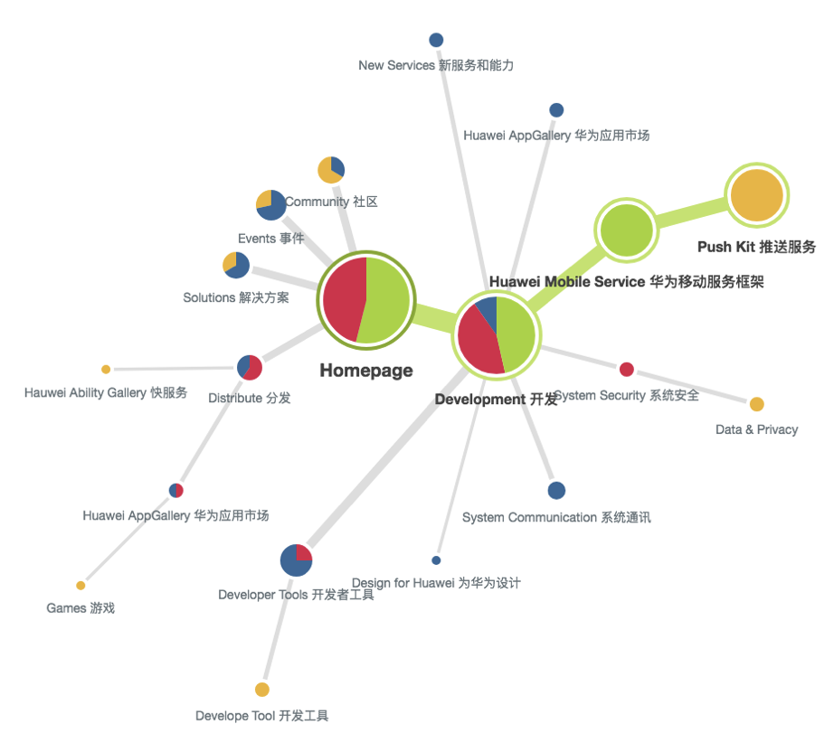
THE NEW HUAWEI DEVELOPER PORTAL
The main focuses of the redesign were to drive the brand impression of Huawei development ecosystem, improve the navigation experience within website and the learning journey of each capabilities. We designed with consistency and produced all the pages in design templates. The final UI was guided by a design guideline proposed from me and the UI team, which considered more usable design patterns and for future scalability.
Homepage
Capabilities navigation
Capability landing page
Support and development guide
Documentation
HOW WE GOT THERE
Restructuring the framework
Within the previous website, the Information Architecture (IA) failed to achieve business objectives and user’s expectations, which caused a major issue in navigation and users’ engagement of finding the content they wanted to. The inefficient navigation and ambiguous information which caused users to get confused and to put in lots of effort searching for the right resources.
Before diving into the design for each pages, we put lots of efforts in organizing content and flow of the website, aiming to come up with a structure that balances the users’ desires with the business’s needs.

Our process of redesigning the website IA
Redesign the IA with users’ mental model
By conducting a card sorting activity with the users, we analysed with users’ mental model of how they grouped information pieces, labeled categories, and their information seeking behaviours.
According to the test results, a redesigned IA was proposed to follow the users journey of product development, lifting Development/ Launch&Distribution/ Promotion into the main navigation. Also, based on the testing result of how users grouped, I categorized all the development capabilities into understandable groups and made sure that the popular ones were easy to find. Within the distribution section, I separated integration to launch and promotion for earnings, in order to differentiate between users’ goals.
The testing result from the card sorting
The Redesign IA
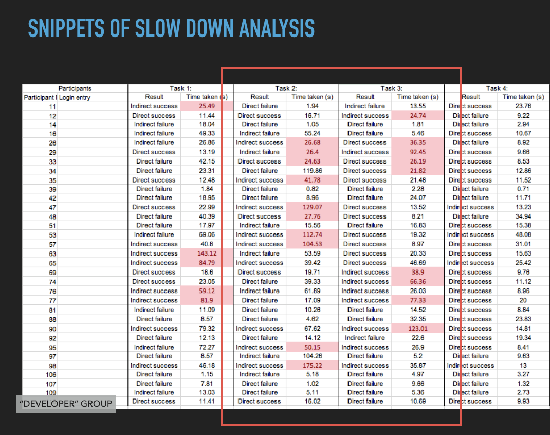
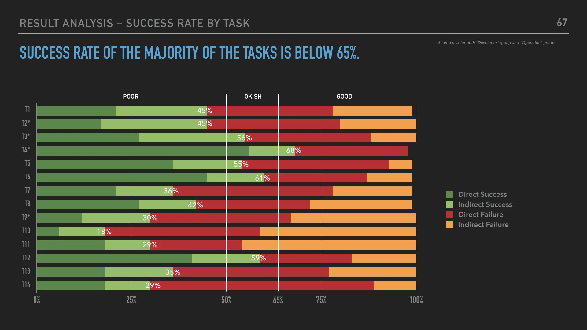
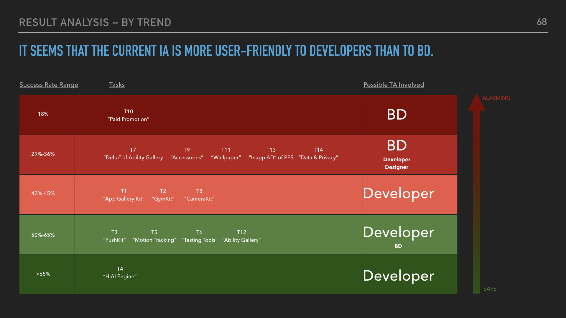
Validation of the redesigned IA
We used online tree testing tool (Optimal Workshop) to measure users’ task success rate, directness, and user perception of the redesigned IA. In order to improve the perfomance of the IA design, various factors should be considered in the analysis. For example, we noticed that there were many slowed downs at task 2 and 3 which was possibly caused by the ambiguous name of the capability. Also the tasks success rate were extremely different between users types (developers v.s. non-developers users) which may be considered as a future suggestion for our clients.
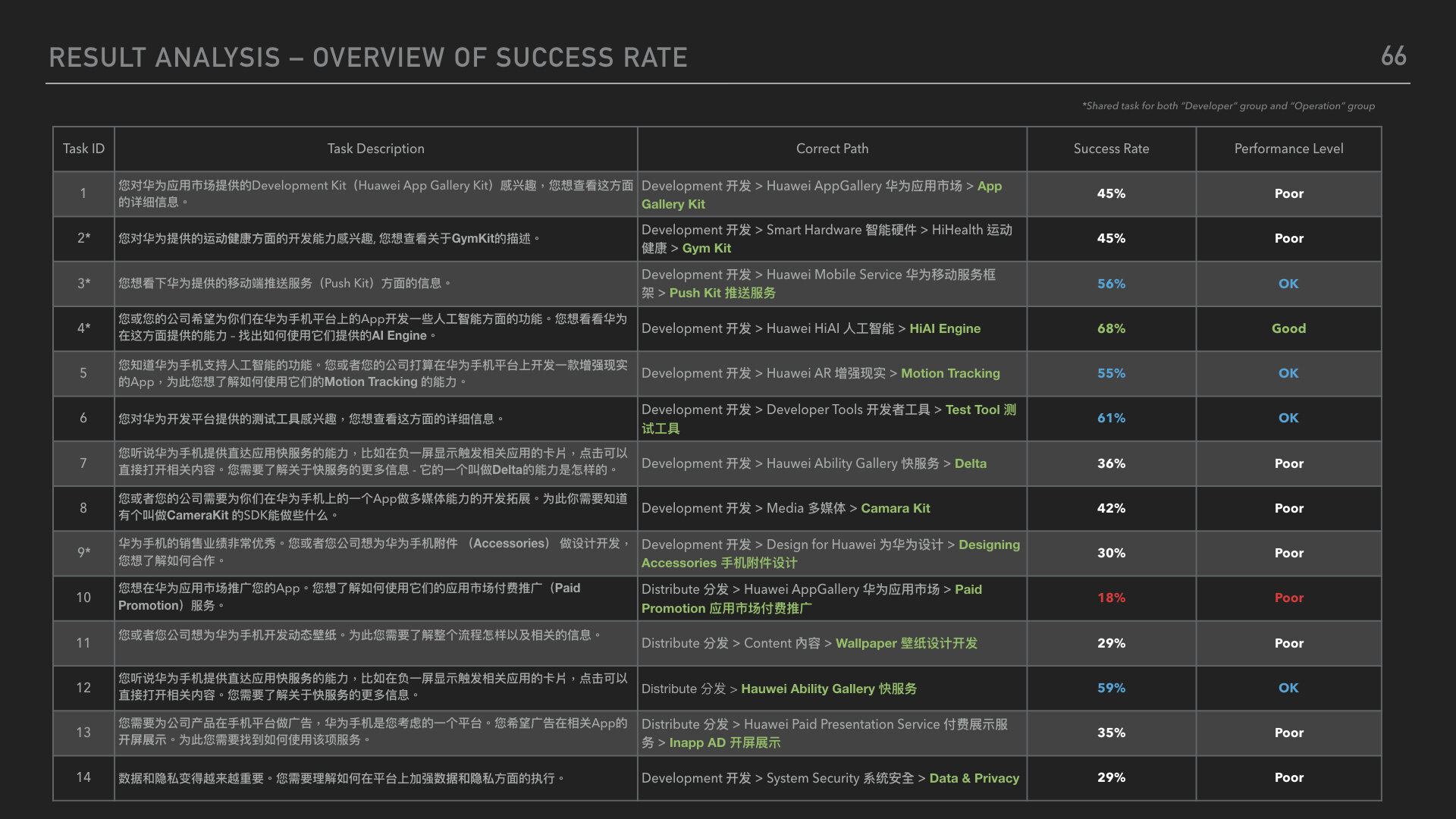
Findings to design directions
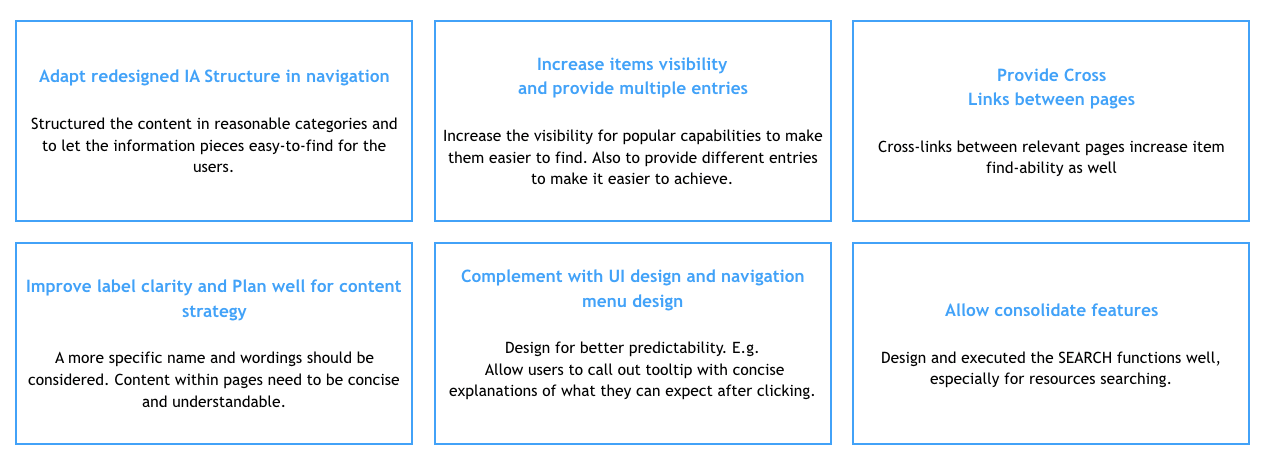
In order to increase the performance of the tested IA, improvements need to be made via the adaptation of content structuring, navigation design, User Interface Design and labelling system in our redesign. Next to that, Providing supplementary functions and content strategy should also help.
ANATOMY OF THE DESIGN DETAILS
HOW WE MAKE it work and FUNCTION
According to the design directions and principles above, I categorised them in 4 main aspects: Navigation, Presentation, Content and Interaction. In order to generate a detailed design specs of what we should take care of when designing for each pages.

Detailed Specs and design guideline
The documentation was created during this project to communicate requirements to all the designers for design priorities and support our clients to better development with future scalability. These deliverables consisted of the customer journeys/ page structure, interaction requirements and the visual design specs as our design system.


MORE ABOUT THE FUTURE
Keep growing the ecosystem
In general, users are satisfied with the usability of our new design. The majority of previous identified usability problems are solved especially the navigation and the restructure of IA which is recognized and confirmed by the users in the 2nd round testing. Other than that, users also find delighting UI elements from the new design within this test.

We also identified that there is a lot of room for improvement in the content strategy which may be the future focus point for the clients. More specific references or detailed content like exact numbers, figures and comparison may help to drive potential customers into frequent users or motivate them to pay for extra services.
The redesign of the website is online now
https://developer.huawei.com/consumer/en/
